THE CHALLENGE
Photos and content don’t reflect the company and mission
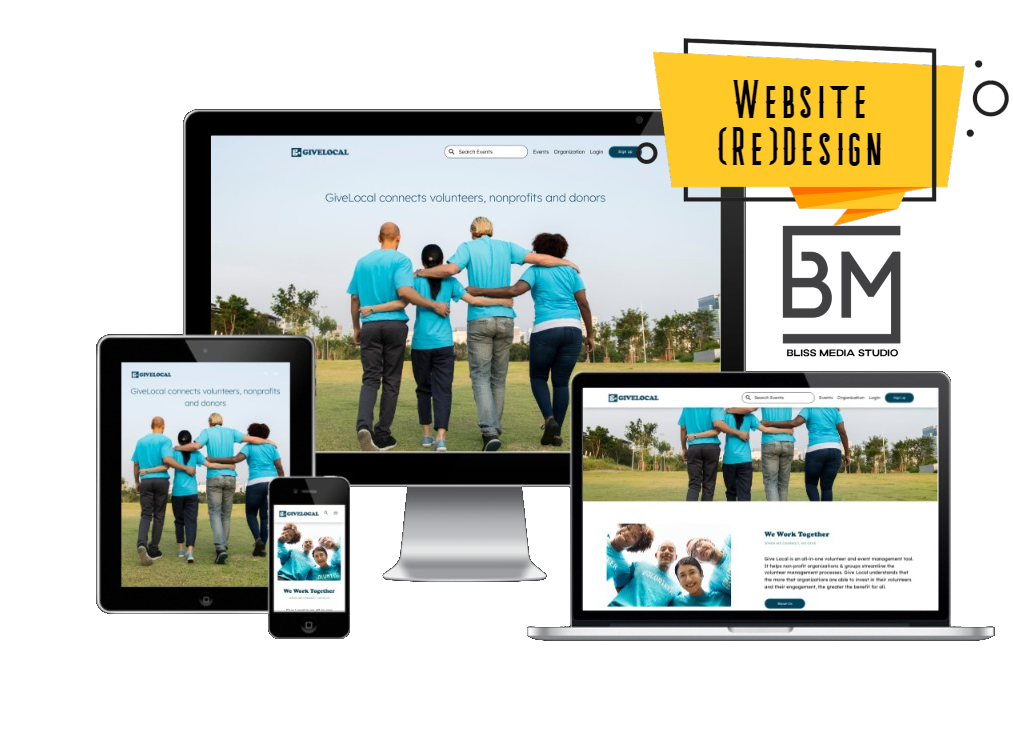
GiveLocal Inc. is a software company that has created a marketplace to connect nonprofit organizations, volunteers, donors, and their communities. Their current site did not reflect their mission to make it easier for nonprofits of all sizes to be more visible to those people who are looking for more opportunities to give back and increase the amount of volunteers and donations that they have access to.
THE SOLUTION
(RE)Design a Website That Showcased Their MISSION, VISION, and MESSAGE
THE SKILLS
REACT/CSS STYLING
UX/UI DESIGN
CONTENT WRITING
CUSTOMIZATION
THE STRATEGY
Because we love what GIveLocal is doing in the community and for non-profits we decided to donate our time for this project. We had to carefully manage the project to get the most value for the time we were able to spend on the project.
01
REQUIREMENTS
Our initial discussions were all about getting our arms around the vision. They had previously hired developers to build out the website but being international, the site did not reflect a local US community and volunteers. We also had to design for three different types of end users; a volunteer, a non-profit charity, and a donor. All of this is on a one-week timeline.
02
UI/UX
We started with mock-ups that aimed to eradicate the social stigma behind doing good and helping others. We wanted fun, positive images that reminded the user of the positive emotion of giving.
03
DEVELOPMENT
This is our first time styling a website within the REACT framework. It took some learning but we quickly discovered how to stylize elements to attain the look and feel of the redesign.
04
TESTING
We performed an array of tests to ensure that our solution was responsive. We generally used real devices rather than emulators to gather and analyze feedback from test users.
05
SUPPORT AND MAINTENANCE
Innovation has no finish line. After we delivered the solution, we performed updates and managed scheduled maintenance.
Jessica Fergus
Owner & Principal Consultant
Let’s Meet
Let’s Talk
![]()
